


I spent about ten years at Barracuda Networks, from late 2005 until 2016, and I was there through the company’s IPO in 2013. I started as VP of Product Management for the whole product line, and when we got bigger, I became the GM of the security business. Barracuda sold security appliances, which were physical boxes that sat in a customer’s network and handled jobs like blocking spam, filtering web traffic, and backing up data. Our customers were mostly organizations with lean IT departments. I haven’t written much about those years here, and I plan to write more about them. This post focuses on one detail, which is how the user interface of our first product was designed to help sell it over the phone.
On a recent consulting project, we were discussing why it would be hard for sales reps to give product demos without a sales engineer at their side, and I thought there could be an easier way. I had real difficulty translating my thoughts into words. When I tried to describe what we did at Barracuda, I felt like I had to show the screens and walk through what actually happened, so I dug up some old screenshots of that first product, the Barracuda Spam Firewall, which was later renamed the Barracuda Spam & Virus Firewall. This post is my attempt to explain my view of sales-led demos.
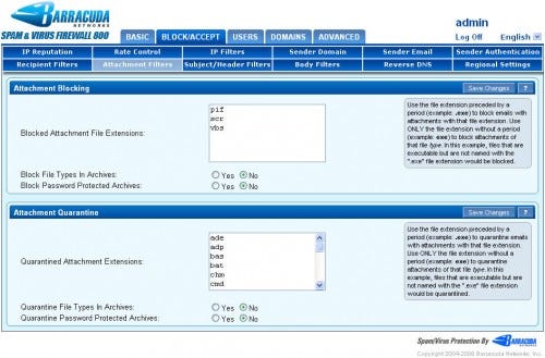
By modern standards, the Barracuda user interfaces were not pretty. The pages were crowded with radio buttons, and a column of gray text boxes ran down the right side of nearly every screen explaining what each setting did.
Just about everyone who joined Barracuda after me objected to some part of our user interface design. New product managers, UI designers, and executives all wanted to know why we used radio buttons everywhere and spent so much screen space on explanations. Their objections weren’t wrong from a screen real estate perspective. What wasn’t obvious from the outside was that the interface had a very specific job, and that job was selling the product over the telephone.
I’ve always found the term “UX” (or “user experience”) a little narrow for that reason. The words take the user into account, but not necessarily the buyer or the seller. A product has to be sold before it is used, and even good sellers often have trouble showing everything a product can do, especially to buyers who know their own environment better than anyone. That was the problem we were trying to solve at Barracuda, and our answer was to optimize the user interface for the way we sold the product.
The Motion
Our calls didn’t use screen sharing, and scheduled WebEx demos weren’t yet the routine they later became. Our default motion started with a Google ad. An IT person clicked through and filled out a lead form, and an inside sales rep called back within minutes of the submission. The rep then asked the prospect to open a web browser, go to spam.barracuda.com (later demo.barracuda.com), and log in with the username demo and the password demo. From there, the prospect was looking at a read-only version of the real product. As far as I know, that site and its equivalents are long gone.
The rep’s skill on that call was knowing where to point. When the prospect asked a question, the rep answered it by directing them to the screen where the answer lived. Often the prospect took over, clicked around on their own, and asked questions as they went. The view inside Barracuda was that the product would sell itself better than any pitch could. That view only worked because the reps knew how to execute the game plan.
Those first calls never involved PowerPoint or marketing collateral. The reps used our website and the product itself. We had collateral, but it typically came later in follow-ups and through channel partners.
If the call went well, the rep offered a 30-day free evaluation through the prospect’s reseller or one we recommended. A box shipped out, and the prospect installed it themselves. We generally didn’t fly anyone out to do installations. Anecdotally, the boxes never really came back. Our overall conversion rate on 30-day evaluations was probably closer to 95 percent, and that figure included plenty of people who never saw a demo at all, since channel partners sent out evaluation units and we honored requests for free evaluations even when customers insisted on not seeing a demo. The interface didn’t produce that result on its own, but the whole motion did, and we saw it across nearly all of the appliances we sold, not just spam filtering. Our sales reps were a big part of that motion. They called back within minutes, knew the product well enough to point to the right screen for any question, and did their jobs quite well. They were an important part of our success.
The Tour
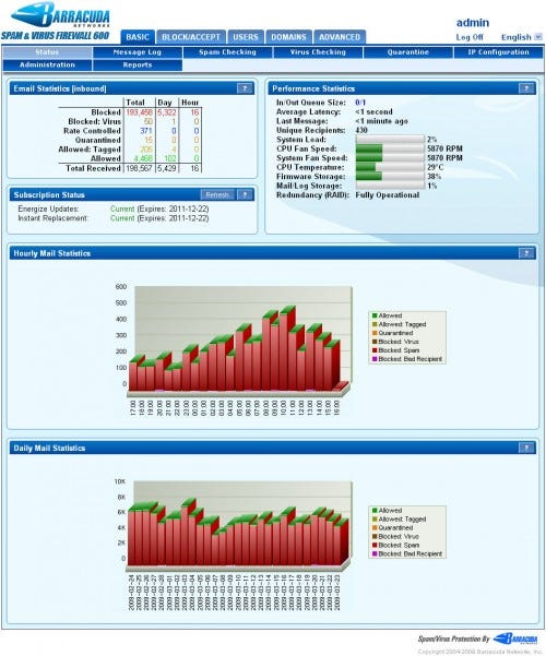
The first stop was usually Basic > Status, which gave an overview of what the product did. For the Barracuda Spam & Virus Firewall, a table at the top counted the messages that were blocked, quarantined, tagged, and allowed, and charts below it showed mail volume over time. In the screenshot below, the box had blocked more than 190,000 messages and allowed fewer than 5,000.
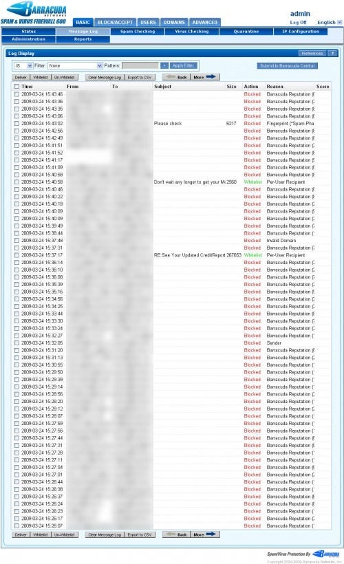
Basic > Message Log showed the same activity one message at a time. A prospect who wanted to know why a particular message was blocked could read the reason right on its line.
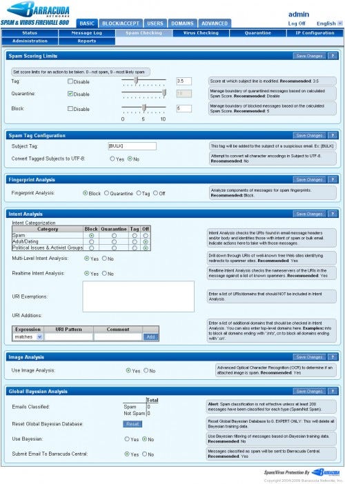
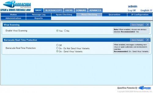
Policy came next. Basic > Spam Checking and Basic > Virus Checking showed how the product decided what to stop, and the Block/Accept tab held the more granular filtering rules.
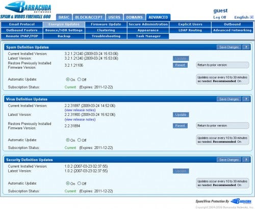
We always ended product demos with Advanced > Energize Updates. The screen showed spam, virus, and security definitions, each set to update automatically, with a note that updates arrived every 10 to 30 minutes as needed. The point of showing it was that there really wasn’t any maintenance. A customer could set it and forget it.
The Ugly Parts Were the Point
The choices that drew the most objections among new product team members were deliberate. There were no pull-down menus on the policy screens because we wanted every option to be visible without explanation. Wherever a drop-down list would have hidden the choices, we used radio buttons, so a prospect on the phone could see every option at once without being told where to click. The language selector in the corner was one of the few drop-downs, and it usually set itself from the browser and operating system.
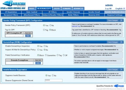
The gray text boxes on the right served the same purpose. Each one explained what its setting did, so a prospect could read the explanation instead of waiting for the rep to give it. When there was uncertainty about what to choose, the box ended with a recommendation, and a recommendation was practically a requirement for any product manager who wanted to add a feature or option. Some of those recommendations didn’t age well. In the early days of DomainKeys, our recommendation was to leave it off, and today just about every mail system checks DKIM, its successor. Even back then, support for DomainKeys was often a buying criterion, so having the feature along with the flexibility to turn it off mattered. The slider for spam scores was intentional as well, and it put the whole range from 0 to 10 on the screen at once.
While these choices were the ones made for the Barracuda Spam & Virus Firewall, we carried the same user interface into all of our other appliances. Our customers typically had very lean IT departments, and the person responsible for email was often responsible for web security, backup, and much more. Since we sold over the phone and didn’t send anyone to do the installation, that person had to look at any Barracuda product and feel comfortable that they could set it up on their own, perhaps with a bit of phone support. Customers appreciated being able to look around freely and make their own decision to bring a box in.
The demo was the real product, not something built to show well on a sales call. We optimized that real product for a particular subset of users, lean IT departments where people wore many hats, rather than for people who could make a whole job out of managing a Barracuda. In that context, we were the anti-Cisco at the time.
Showing every option also fit how we priced the product. We didn’t upsell options at Barracuda, and we had no per-user fees and no per-option fees. Our customers valued being able to do whatever the box would let them do, and the interface put all of it in plain view.
Daily users likely paid a price for this approach. Some things were a bit difficult to set because of our layout. Some competitors offered rule-based interfaces that made the order of precedence for filtering very clear and made advanced exception handling easier. We believed a list of rules was harder to sell than a screen that laid out all of the different components of filtering visually, and we accepted that trade-off.
Defending It
When I joined, the basic structure of the interface already looked like this. Credit goes to the company founders and early engineers. Over the years, first as head of product management and later as GM, I helped modernize it, adapt it for new features, and carry it into other products. The biggest part of that work, though, was educating the product managers and UI designers who came after me about the design philosophy behind it.
We held what we called, in the language of the day, “GUI grope” sessions to review changes and make sure each one stayed purpose-built for our selling motion. We always had to defend the radio buttons and the apparently inefficient use of screen real estate. A big part of the job was keeping the design consistent so the formula would keep working. We carried the same formula into our other products. The web filter, the web application firewall, SSL VPN, email archiver, backup, and other products all used the same menu layout and the same sales process.
One Box, Read-Only
Because the demo was read-only, many reps could send people to the same site at the same time. The site wasn’t limited to our own inside sales team, and channel partners around the world used it with their own prospects. We had no other demo environments to build, no virtual machines to stand up, and nothing to reset after each call.
The data flowing through the demo was real, but it was not customer mail. The screenshots shown here for the Barracuda Spam & Virus Firewall came from real, sanitized mail traffic flowing to what was essentially a honeypot, and for other products, we set up honeypots and test environments of our own. In all cases, prospects were watching a real appliance process actual traffic behind a read-only login.
What Changed
The interfaces changed, of course. This formula was used for appliance user interfaces, and customers understood that getting an appliance meant talking to someone on the phone. Cloud-only products brought a different set of user expectations.
These products didn’t include many of the onboarding tools used today. At the time, we didn’t use wizards or guided walk-throughs. Our customers would just log in and start using the product.
What I’d Carry Forward
In the consulting conversation that started this post, the question was how sales reps could demo a modern product the way we did in the Barracuda days. The demos I’ve seen there involve interactive steps and virtual machines that have to be stood up and reset. That setup is solving a different problem than ours did at Barracuda back then, and I’d like to see which of our ideas still apply today.
What I’ve described here belonged to a particular point in time. We sold appliances over the phone to lean IT departments in the years before screen sharing was common, and many of the specifics may not apply today. Radio buttons and gray text boxes are not the lesson.
What I’d really like to carry forward is the value we experienced from having a user interface optimized for how we sold the product, and I do think some of that thinking could apply today. Some of what we did resembles what people now call product-led growth, though ours still ran through a sales rep on the phone. The buyer and the seller are constituencies too, not only the person who uses the product every day. At Barracuda, that value showed up as a rep who guided the prospect through the product rather than through a pitch, a screen that showed every option and recommended a choice wherever there was uncertainty, real data from a real system, and a demo that needed no environments to manage, so our reps and channel partners around the world could all use it at the same time.
The interface wasn’t pretty by modern standards, and it wasn’t the most efficient design for long-term use. It was amazing, though, how well it worked in the days before scheduled WebEx demos, when a rep could call someone minutes after they filled out a web form and have them experience the product in their own browser. Digging up these screenshots turned out to be the best way I found to explain it, and I wanted to write down what we did as a way to start a new conversation.
AI disclosure: I used AI tools during the drafting and editing process to help clarify structure and language. All ideas and judgments are my own, and I reviewed and edited the final wording.