

Building a Gratitude App I Wanted to Use
Why I ended up making a small, shared journaling tool instead of adopting another platform

Our older daughter asked Marsha and me to join a gratitude journaling app called Gratitude Plus. The pitch was straightforward. Instead of gratitude journaling being a solo practice, it could be something you share with other people. For our situation, that sounded like a feature, not a gimmick. She was already writing entries for a friend group, so Marsha and I were just another circle she could share with. It was low effort for her, and it gave us a small day to day window into her life without turning it into a whole thing.
I also liked that it let her share the same entry with different groups without forcing everyone into one big shared room. That mattered. I did not want our posts showing up in her friends’ space, and I did not want her friends’ posts filling up ours. The app’s group model made that feel simple and clean.
We had done a version of this before with our friend Kristin, using iMessage. It worked because texting is easy and collaborative. The downside was that it mixed gratitude entries into the same channel we used for everything else. Over time, those messages sat next to logistics, links, and random updates, and it stopped feeling like its own practice. When our daughter suggested a dedicated space, I was ready to try again.
Once I started using it, though, I ran into something that has been a recurring theme for me with a lot of modern apps. It felt heavy. What followed was a slow realization that the app was solving a different problem than the one I cared about.
Why the commercial app did not work for me
The mismatch showed up in a few specific ways.
Weight / friction. My issue was not that the app was bad. It was that the deal did not match what I wanted. A gratitude journal, at least for me, needs to be lightweight. I want it to be easy to do every day. I do not want the software to add work in the name of adding value.
Gratitude Plus offers a lot of content and structured engagement. It has things like a community feed, prompt variety, and “insights” that try to turn the journaling into something richer and stickier. Those features might be exactly what some people want. For me, they made the core activity feel less like reflection and more like a product experience.
Public feed vs small-circle sharing. The public feed also felt off for the kind of sharing I cared about. I was not looking for a broad social media layer. My motivation was small circle sharing, mostly family. I was not trying to watch strangers be grateful. That is a different activity.
Upselling and data access. The biggest turnoff, though, was upselling. The app was good at reminding me what lived behind the subscription. At one point I realized that even exporting my data was treated as a premium capability. It made me like the deal less. If the journal is going to contain my words over time, I want it to feel like mine. Discovering that I had to upgrade to get my own writing out of the system made me hesitate about putting more into it.
I was ready to move on. Marsha simply said she was disappointed that I was no longer participating in the sharing circle. There was no drama. She made a statement, and I took it seriously.
Requirements when evaluating alternatives
There was an interesting disconnect. Marsha explicitly asked me to look into vibe coding something. My first instinct was to try to find an open source gratitude journaling app that already did what we wanted. It’s funny that before the advent of vibe coding, she would have never asked me to build something! In any case, I did have a list of requirements as I was entertaining the request.
Social journaling. There were many open source options, but the popular ones I found leaned toward personal journaling. They were designed for one person writing for themselves, not a family or a few friend circles sharing together.
Streamlined feature sets. I also looked at private social media tools. They were often free, and they often had decent UX. They also had too many features. Most of them solve a broader problem than what I was trying to solve, which means I would have to “lock down” the experience to make it feel like a calm gratitude journal. That started to feel like the kind of work you do when you customize a large platform for a narrow use case. It is possible, but it is still heavy work, and it does not necessarily land in a place that feels simple.
Write once, share to many. The constraints that mattered were mostly human. For our older daughter, I wanted to preserve her ability to write an entry once and share it with multiple circles. A lot of group tools treat each circle as a separate space, which would push her toward retyping or copy and paste. She already had a habit. I did not want to make it harder.
Phone and computer access. For Marsha, I wanted it to be easy on both her phone and her computer. A plain web app has a lot going for it here. It loads, it works, and nobody has to update anything. I do plenty of tech support at home already.
Authenticity. I also had my friend Kristin in mind. I did not even know if she would ever want to do this again with us after a failed attempt using straight-up texting. If you are inviting someone into something reflective, the tool has to feel private and real. Some social products feel performative even when they are “private,” and that was not the direction I wanted.
At that point, starting fresh began to look like the most direct and authentic route.
Why I built it on old boring infrastructure
I reinstated Cursor, opened a GitHub project, and started writing down what I wanted. I was already paying for Cursor, so it was never truly “free.” I just wanted to be deliberate about where the money went and what I got for it.
I did not want to build this as an iOS app to avoid the ongoing costs of the Apple Developer Program cost to keep it in the App Store. I also did not want to base the backend on something like Supabase that would push me into cost higher tiers as soon as the project became real.
I already have a long running hosting plan with IONOS that I use for family sites and side projects. Using what I already had felt like the simplest way to keep this free from incremental subscription costs.
Starting from first principles
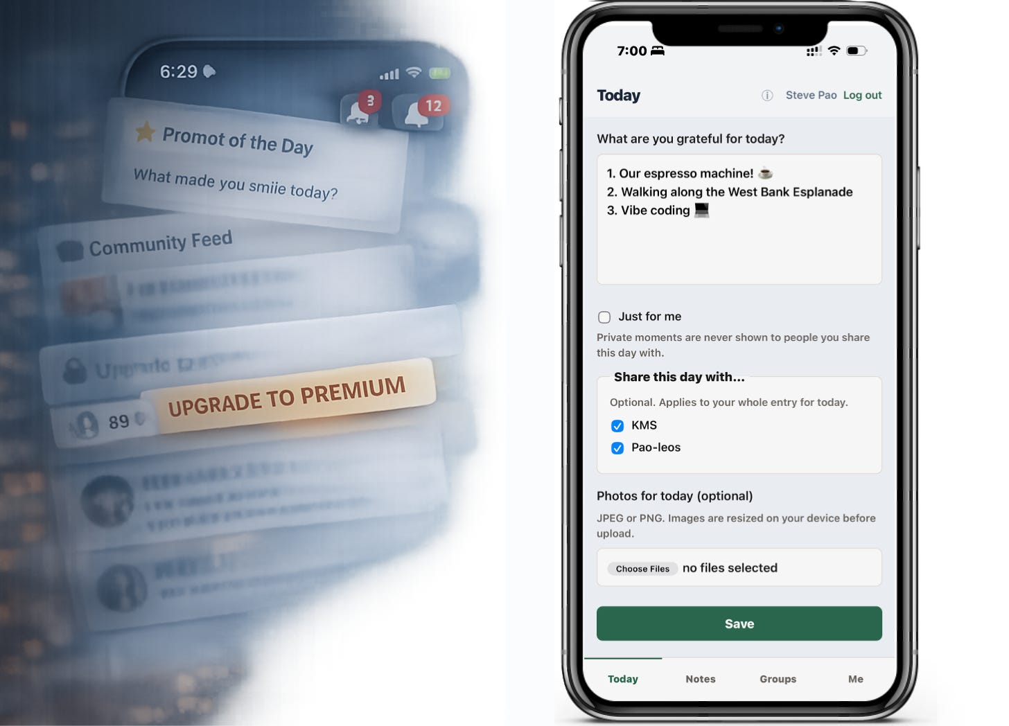
The first version was intentionally primitive. One page called Today, where you enter a gratitude entry. Another page called Notes, where you can read entries. No users. No logins. No reactions. No comments. No photos. I just wanted to get a feel for what people would actually do.
What surprised me right away was how much I appreciated speed. The app loaded instantly and did the one thing it needed to do. That experience pushed me away from visual ornamentation. I had originally imagined a menu bar with icons and some graphics to make it feel more designed. Once I felt how fast plain text was, I chose to lean into text and emoji wherever I could.
That choice has an obvious downside. It is hard to keep a plain text app from drifting into ugly. I still think it is a little ugly. I can live with it, but I notice it.
Marsha and I talked about why I started with something basic and kept adding features. I did not do enough top down design work on layout and information hierarchy. It was very much build a slice, then add another slice. That approach made it easy to start, and it also made it easier to end up with a UI that shows its history, particularly that it’s built on old school web hosting technologies.
The old technology makes certain “simple” features more annoying than one would expect in 2026. Adding multiple emoji reactions without refreshing the page quickly became a little front end project. Resizing images client side quickly became a JavaScript project. Those were not deal breakers, but they continue to force real tradeoffs when working with old school tools.
When it became a real app
The first big step after Today and Notes was users. I implemented Google sign in and an email login flow that uses a PIN. That meant pulling in libraries for OAuth and SMTP email. Once users existed, groups came next, and then sharing. Conceptually those were straightforward, and they were the heart of what we wanted. The whole point was being able to write once and share to multiple circles without making it awkward for anyone.
One thing I learned from this is that vibe coding makes it easier to build incrementally without a lot of upfront planning. You can add a feature, see what breaks, and then add the next one. The downside is that you can end up with an app that feels incremental, because it is.
At the same time, I am not sure that a heavy upfront plan would have made this better. It might have made it prettier. It might have produced a cleaner information architecture. It also might have made it harder to start.
Where I think this goes
I do not know if anyone will use this app over the long haul. I have had starts and stops with gratitude journaling myself. A purpose built app does not magically fix that.
I can see why Gratitude Plus leaned into more content and broader engagement features. Habit formation is hard. People are trained by social media to expect feeds, prompts, and novelty. Those mechanics probably help retention. They are just not what I wanted.
My success bar is modest. If six months from now we have a good history of the previous six months with family, and maybe one or two friend circles, I will be happy. I want it to feel like a quiet record of life, not a streak.
Vibe coding has changed how I think about building in general. In the past, I might have tried to customize a larger open source project and lived with it. Now I find it hard to justify spending a lot of effort customizing big platforms when a purpose built tool can be built quickly from the ground up. That is a professional observation as much as a personal one, and as an investor I do think SaaSopocolypse is a real phenomenon. I am not trying to make a grand claim here. I just notice how the economics feel different than they used to.
I have been using Thankhill in my own notes to refer to this project. That name might stick, or it might not. The bigger point is that it exists, and it is for anyone to use, and it fits the deal I wanted.
If you are interested in using the app, I would love that. If reading this makes you curious about building your own small tool for a specific need, even better. More than anything, I wanted to get you thinking about how vibe coding is changing the landscape for how we approach solving day-to-day problems.
AI disclosure: I used AI tools during the drafting and editing process to help clarify structure and language. All ideas, judgments, and final wording are my own.
I'm interested in starting my Gratitude journey, where do I start?